
Welcome to the AI and Statistics series!Let’s dive into how AI can transform tabular data into various types of charts.Today, we will be using an Interpolation from standard curve dataset to generate a dual-axis S-shaped curve chart.
Interpolation from the standard curve is a method used to estimate unknown values within the range of a set of known data points.
This method is crucial in fields such as biochemistry and engineering for determining concentrations of substances in various samples.
The dataset consists of log(Concentration) and Density values, key for creating the standard curve.
Our analysis focuses on creating a standard curve to estimate unknown sample parameters and showcasing the importance of proper data fitting and interpolation techniques.
By examining this dataset, we aim to predict the log(Concentration) for unknown density values, thereby providing key insights into the data.
Don’t worry about using the AI Agent-driven Bayeslab, all you need is natural language to get the data analysis result.
All content will be explained in the most comprehensible natural language descriptions to help you get started with data analysis from scratch.
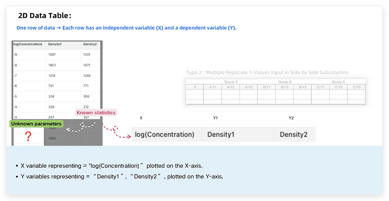
We’ll start with a data table featuring columns “log(Concentration)”, “Density1”, and “Density2”.The chart helps illustrate the relationship between concentration and density over a range of values by fitting an S-shaped curve.
We’ll delve into how these prompts influence the final charts and uncover techniques for effective data visualization.
In just 2 minutes, you’ll learn to generate an accurate standard curve and interpolate unknown values. Let’s start it right now!
Using different prompt inputs, we’ll demonstrate how AI aids in creating and interpreting standard curves.
Our steps will include:
Step 1 — Identify and handle errors in curve fitting.
Step 2 — Correctly fit the standard curve and perform interpolation.
Step 1 — Identify and handle errors in curve fitting.
We first demonstrate a scenario where errors might occur in curve fitting.
The Prompt is:
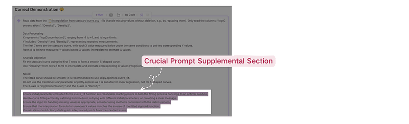
Read data from the Interpolation from standard curve.csv file (handle missing values without deletion, e.g., by replacing them). Only read the columns: “log(Concentration)”, “Density1”, “Density2”.
Data Processing
X represents “log(Concentration)”, ranging from -1 to +1, and is logarithmic.
Y includes “Density1” and “Density2”, representing repeated measurements.
The first 7 rows are the standard curve, with each X value measured twice under the same conditions to get two corresponding Y values.
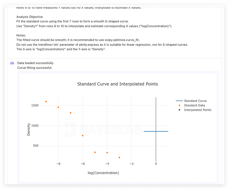
Rows 8 to 10 have measured Y values but no X values; interpolate to estimate X values.
Analysis Objective
Fit the standard curve using the first 7 rows to form a smooth S-shaped curve.
Use “Density1” from rows 8 to 10 to interpolate and estimate corresponding X values (“log(Concentration)”).
Notes:
The fitted curve should be smooth; it is recommended to use scipy.optimize.curve_fit.
Do not use the trendline=’ols’ parameter of plotly.express as it is suitable for linear regression, not for S-shaped curves.
The X-axis is “log(Concentration)” and the Y-axis is “Density”.
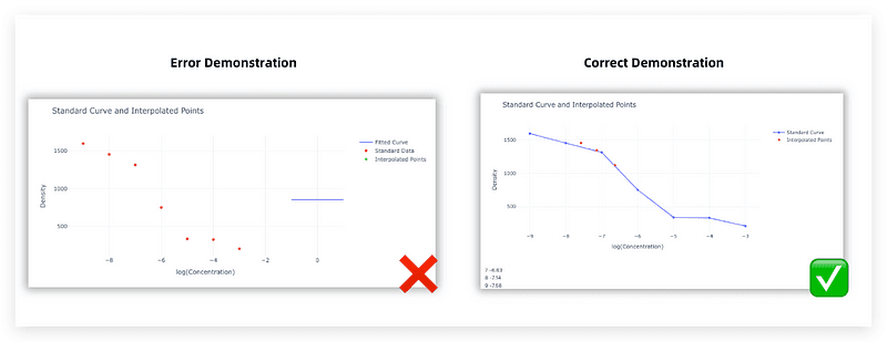
Once the above prompt is written, click ‘Run’ to check for error messages and incorrect visualization due to inappropriate handling of curve fitting.
Step 2 — Correctly fit the standard curve and perform interpolation.
Now, we will correctly fit the standard curve using proper methods.
The Prompt is:
Read data from the Interpolation from standard curve.csv Interpolation from standard curve.csv file (handle missing values without deletion, e.g., by replacing them). Only read the columns: “log(Concentration)”, “Density1”, “Density2”.
Data Processing:
X represents “log(Concentration)”, ranging from -1 to +1, and is logarithmic.
Y includes “Density1” and “Density2”, representing repeated measurements.
The first 7 rows are the standard curve, with each X value measured twice under the same conditions to get two corresponding Y values.
Rows 8 to 10 have measured Y values but no X values; interpolate to estimate X values.
Analysis Objective:
Fit the standard curve using the first 7 rows to form a smooth S-shaped curve.
Use “Density1” from rows 8 to 10 to interpolate and estimate corresponding X values (“log(Concentration)”).
Notes:
The fitted curve should be smooth; it is recommended to use scipy.optimize.curve_fit.
Do not use the trendline=’ols’ parameter of plotly. express as it is suitable for linear regression, not for S-shaped curves.
The X-axis is “log(Concentration)” and the Y-axis is “Density”.
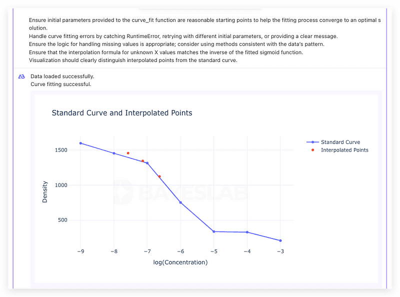
Ensure initial parameters provided to the curve_fit function are reasonable starting points to help the fitting process converge to an optimal solution.
Handle curve fitting errors by catching Runtime Error, retrying with different initial parameters, or providing a clear message.
Ensure the logic for handling missing values is appropriate; consider using methods consistent with the data’s pattern.
Ensure that the interpolation formula for unknown X values matches the inverse of the fitted sigmoid function.
Visualization should clearly distinguish interpolated points from the standard curve.
Once the above prompt is written, click ‘Run’ to see the correct standard curve along with interpolated values, providing a clear and smooth S-shaped curve.
Thank you for reading this installment of the AI and Statistics series!
We showed how to use standard curve fitting and interpolation to estimate unknown data points accurately.
Stay tuned for our upcoming demonstrations to explore more fascinating data visualization.
Using AI Agent and Bayeslab, anyone can organize, analyze, plot data charts, and make business data predictions like a professional data analyst based on previous data.