Analyze Deeply
Share Instantly
The Deep Analysis Agent that transforms raw data into boardroom-ready reports
Your AI-Native Data Analyst
Clean, visualize, and model data at the speed of thought. Turn raw files into professional reports automatically.
Agent-Driven Deep Analysis
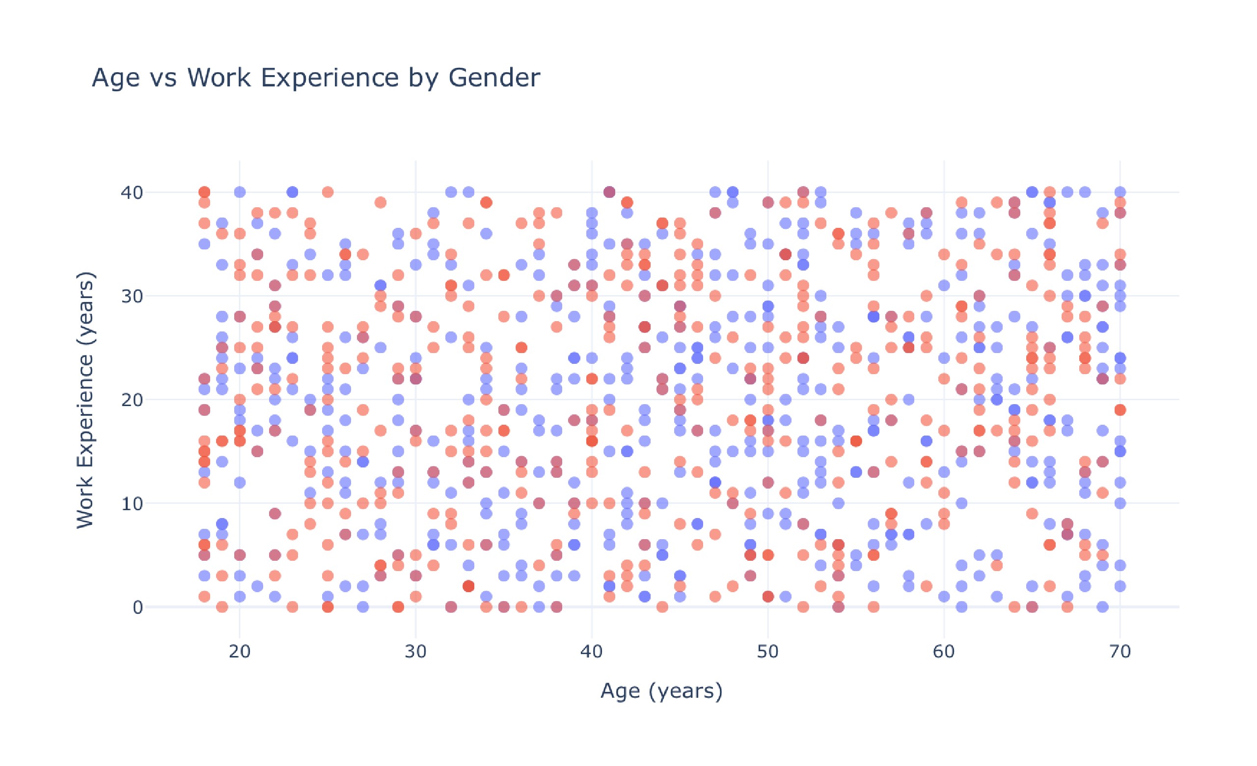
Explore the unknown autonomously. Don't just ask questions—let the AI explore for you. Our agents autonomously traverse your data from every angle, uncovering hidden, multi-dimensional insights you didn't even know to look for.
Reliable & Reproducible AI
Zero hallucinations, verified results. Unlike standard LLMs that guess, Bayeslab writes and executes actual code to derive answers. Every insight is mathematically sound, completely reproducible, and backed by ironclad logic.
Visual Thinking & Cross-Validation
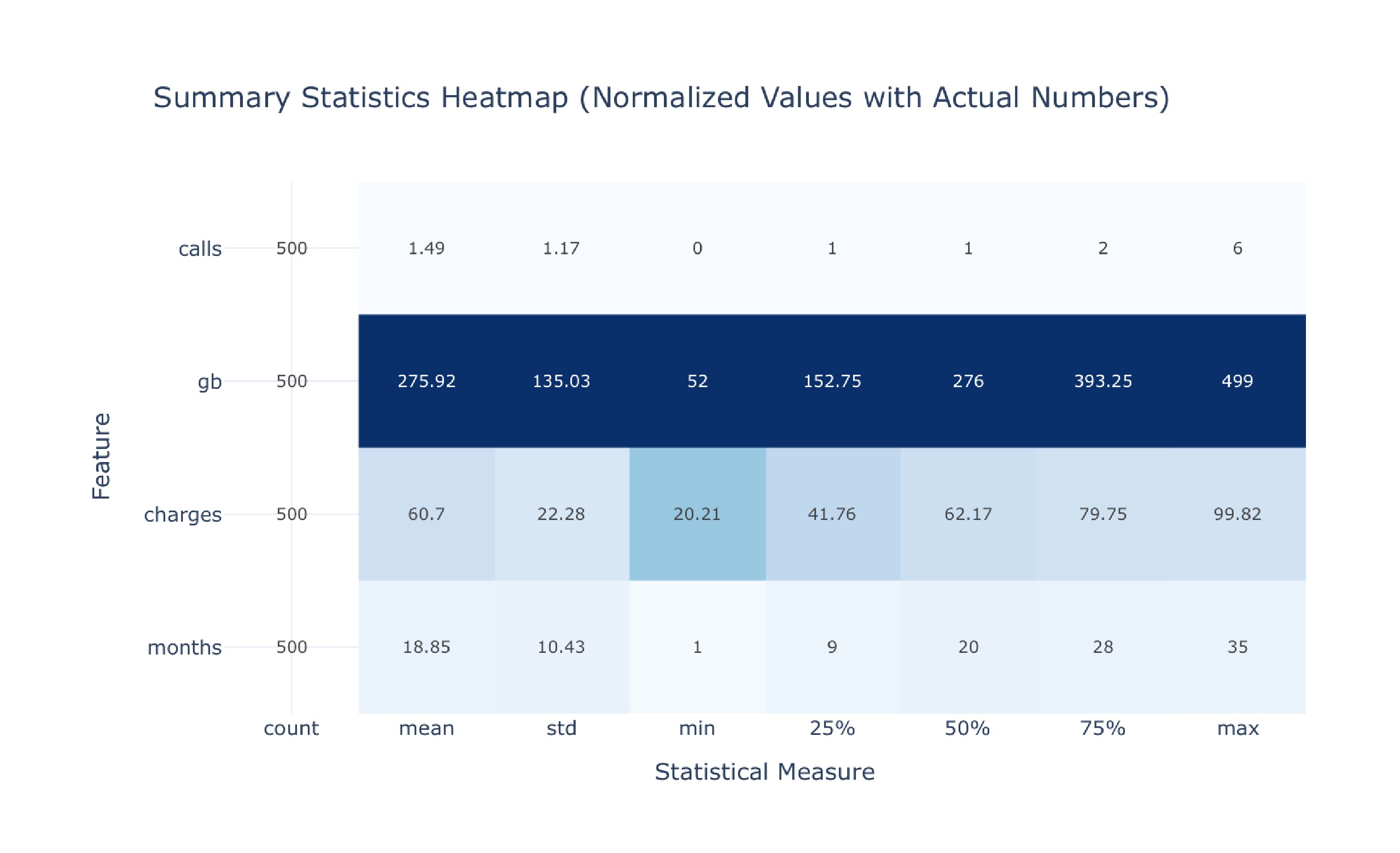
AI that "sees" the data. Bayeslab analyzes charts visually and cross-references them with raw datasets. This dual-check system detects anomalies and verifies trends that text-only models typically miss.
Proactive Collaboration
A partner, not just a chatbot. Stop repeating yourself. Bayeslab remembers complex project context and proactively asks clarifying questions instead of making assumptions, adapting to your business logic like a senior analyst.
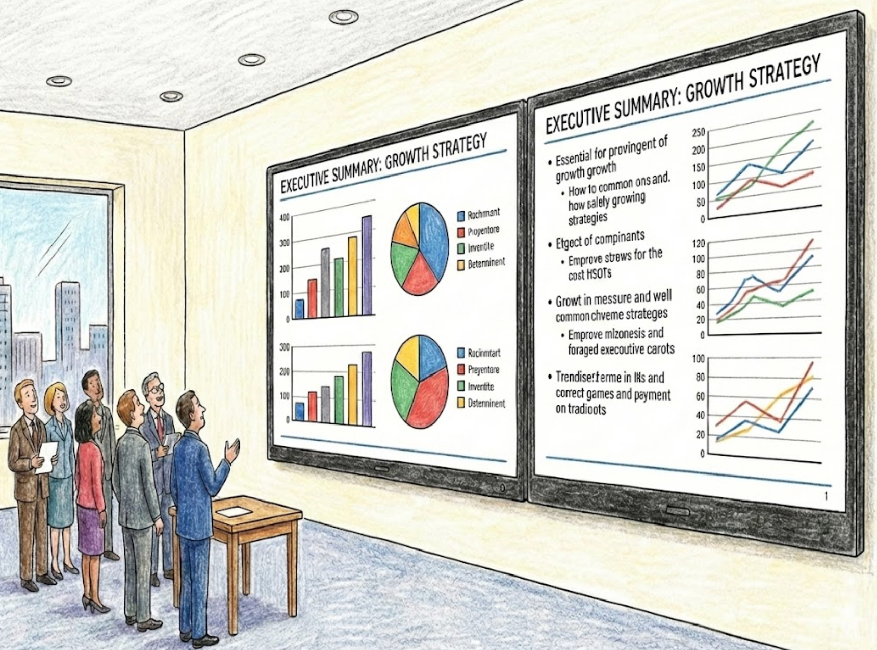
Boardroom-Ready Reporting
From raw data to presentation in one click. Skip the formatting hours. Instantly generate narrative-driven reports with consulting-firm quality layouts, designed specifically for executive review and strategic decision-making.
Why Bayeslab vs. Generic Agents
Generic LLMs are creative partners. Bayeslab is a rigorous data scientist. We replace "hallucination-prone" text generation with "board-ready" enterprise reliability.
Output
BayesLab Advantages
| Core Capability | Bayeslab.ai | Generic Agents |
|---|---|---|
| Logic & Reasoning | Deterministic Code Execution Proprietary engine writes and runs code. Verifies every step before output. | Hallucination-Prone Statistically guesses the next word. Prone to "math-drift" and logic errors. |
| Metric Definition | Immutable Business Logic Centrally defined metrics (e.g., LTV) are locked and enforced across all reports. | Inconsistent & Fluid Re-defines metrics every session based on the context window. |
| Presentation Design | Consulting-Grade Slides Outputs ready-to-use .pptx decks and interactive dashboards instantly. | Markdown / Wall of Text Outputs unstructured text that requires significant manual formatting. |
| Enterprise Governance | Transparent Data Lineage Full audit trail. You can trace every number back to the raw data source. | Black-Box Operations Opaque processing makes compliance and verification impossible. |
No complex setup. No data science degree required.
See the Depth in Action
From predictive trends to deep-dive audits. Explore how Bayeslab uncovers insights across various industries.
Analyze credit risk data and predict high-risk customers
Predicting churn risk for existing customers
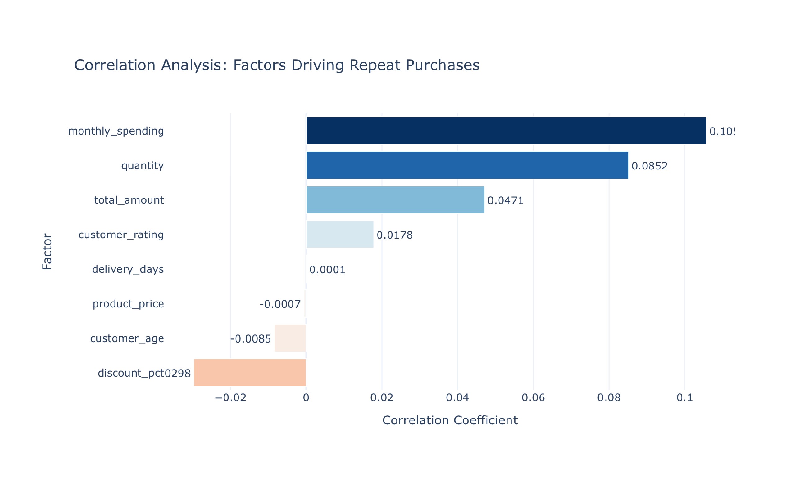
Comprehensive Customer Purchase Dataset Analysis
Comprehensive User Behavior Data Analysis
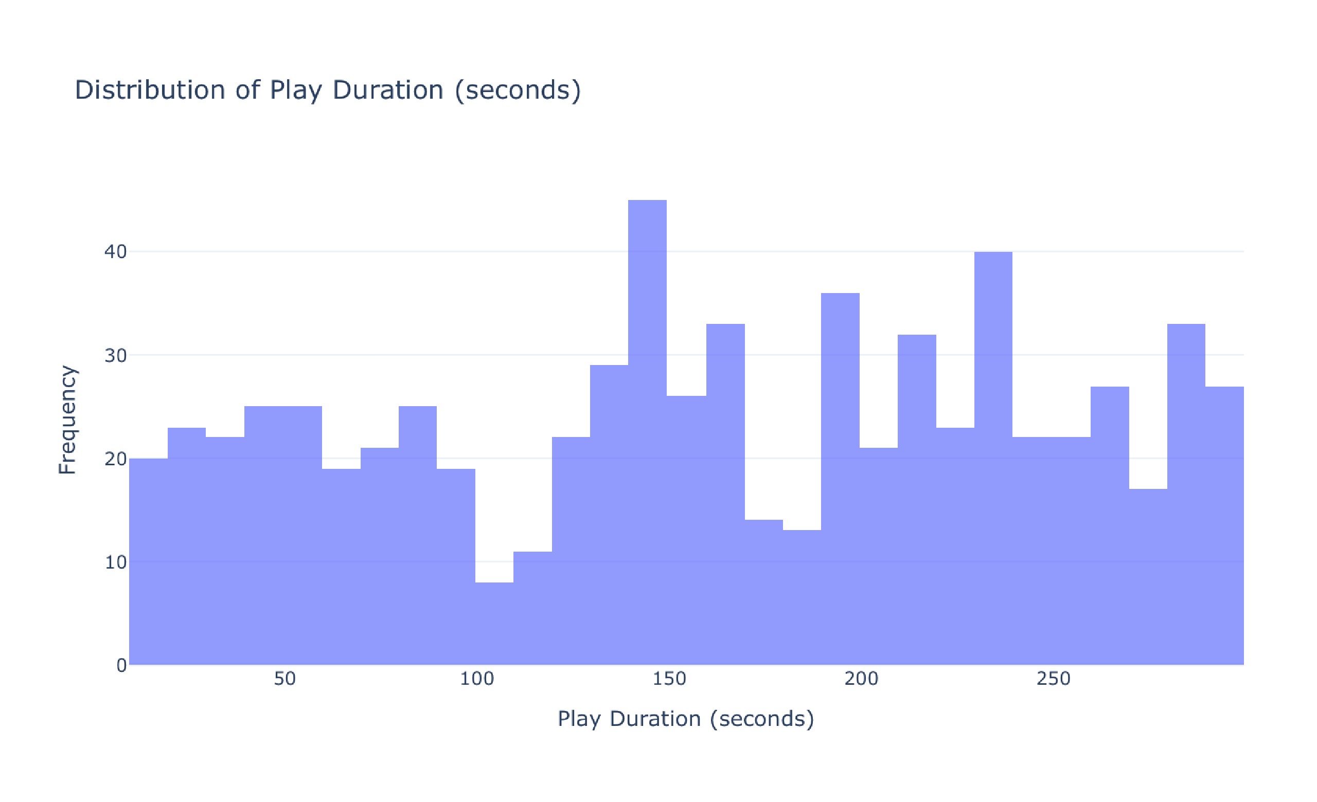
Comprehensive Analysis of Music Streaming Behavior Dataset
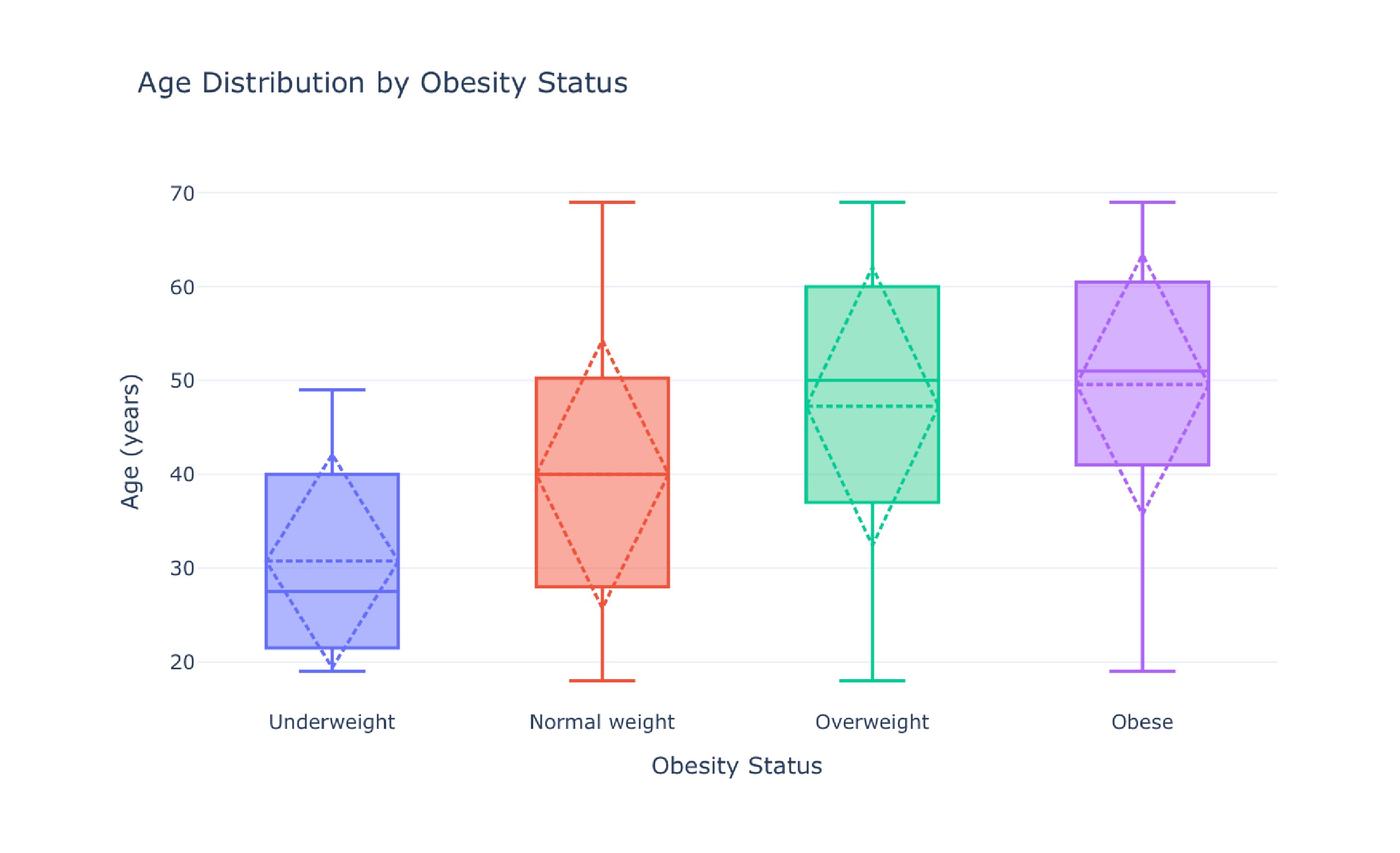
Analysis of Diet Habits and Obesity Dataset
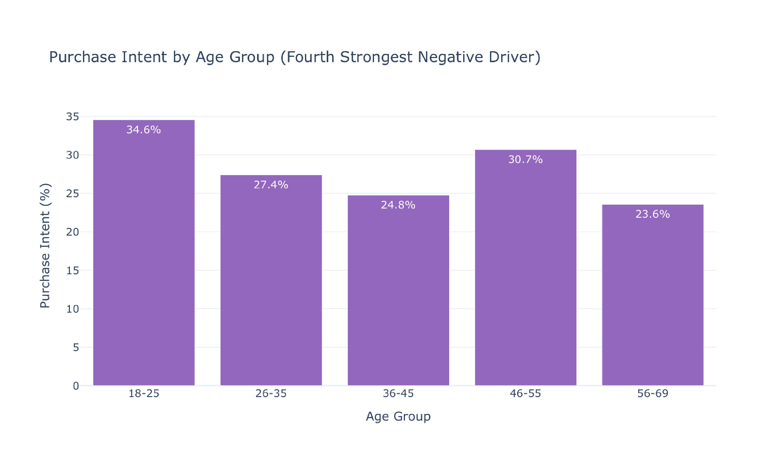
Comprehensive Customer Survey Data Analysis
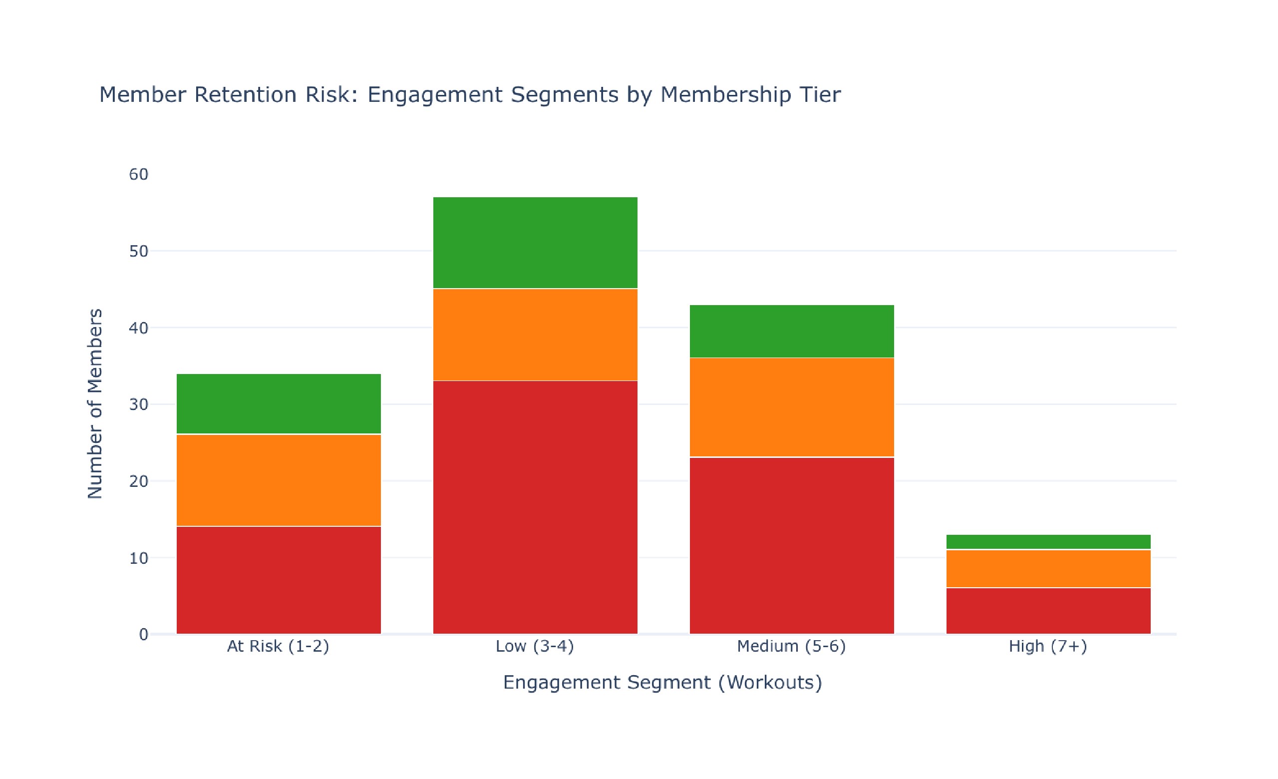
Comprehensive Gym Workouts Dataset Analysis
Ready to impress your team?
Stop wrestling with spreadsheets. Upload your data and let Bayeslab craft your next definitive analysis in minutes.
No complex setup. No data science degree required.